

Ever rage-quit a site because it took too long to load Or dropped out of a signup form asking for your life story? Same.
Users begin forming a visual judgment in 50 milliseconds. You do not have long to make the page feel clear, familiar and trustworthy. Google researchers proved this in eye-tracking studies of how people process visuals.
By the time you finish this sentence, you have already decided to stay or leave.
This week I’m covering:
Why slow sites feel like a threat to your brain
Hidden friction that kills conversions
How top companies turn friction into an advantage
The #1 mistake that drives users away
When friction is good
At a startup bank where I worked, we had a two-factor authentication system. A clunky mini-calculator was required to access savings accounts. We thought it was super annoying and wanted to scrap it.
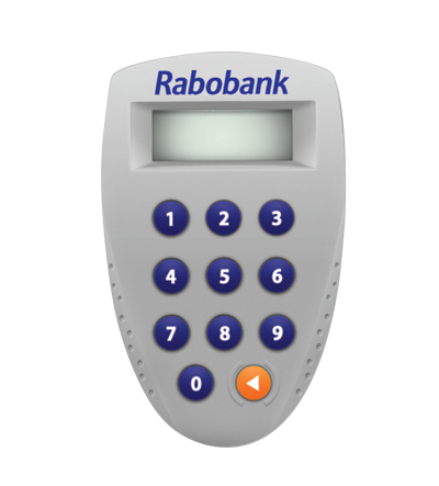
Then we asked customers.
They loved it.
The extra step made their money feel more secure. Some even said it stopped them from blowing their savings on late-night Amazon binges. Because they could never find it. If we had removed the friction, we would have made the experience worse. Not better.
Most startups obsess over features while ignoring the tiny annoyances that make users give up. They cannot figure out why signups are tanking while their product is packed with everything users want. This is the same reason why a better product won’t always save your startup. It’s about reducing the right friction, not just adding features
Users do not care about features if they cannot get past your signup flow.
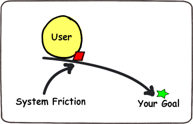
Fight-or-Flight UX
We're hardwired to avoid hassle.
This cognitive overload is exactly what makes decision-making so hard in high-stakes business situations too. MIT neuroscientists found our brains process visual information in just 13 milliseconds. Subconscious judgments happen before conscious thought kicks in.
Here’s the data:
Google's PageSpeed Insights team found a 100-millisecond delay drops conversions by 7%. A tenth of a second costs you real money.
Baymard Institute research shows the average checkout has 11.3 form fields, but only 8 are actually necessary. One major eCommerce site removed the unnecessary fields and conversions jumped 30%.
According to a 2023 Google/SOASTA study, 53% of mobile visitors abandon sites that take over 3 seconds to load.
As Nielsen Norman Group's co-founder Jakob Nielsen puts it:
Users spend most of their time on other sites. This means that users prefer your site to work the same way as all the other sites they already know.
For scrappy startups, this matters even more. No one's sticking around because they love your brand. They'll bounce and never think about you again.
This is why trust, not just a streamlined funnel, is what actually closes deals, especially in B2B.
Death by paper cuts

Most founders can't see friction because they've used their own product 10,000 times. But new users feel every bump in the road.
The worst offenders:
Slow pages. Feels like broken WiFi.
Signup walls. 26% bounce before seeing value.
Mystery buttons. No clue what they do.
Too many steps. Three would do.
Bad error messages. Developer hieroglyphics.
Think your product is friction-free?
Test it like this:
Get five friends who've never seen your product. Watch them use it without helping. The awkward silence as they try to figure out what to click next? That's friction screaming in your face.
Check your analytics. Where do users drop off? That's your friction hot spot.
Fix friction or lose users
When you find friction, eliminate it like your business depends on it. Because it does.
Cut every unnecessary step. According to Forrester Research, 88% of online consumers are less likely to return to a site after a bad experience.
Speed up everything. Your clever animations aren't clever if they make the page load slower.
Make decisions obvious. One clear button is better than five competing ones.
Give instant feedback. Nothing is more frustrating than clicking a button and wondering if it worked.
Amazon's one-click buying was business genius. When they patented it in 1999, it was worth billions. They removed an entire checkout process and have been printing money ever since.
When Friction is a feature
Not all friction is bad. Sometimes it's what makes your product work.
Duolingo uses streaks to keep you coming back. That pressure to maintain your streak? Intentional friction that works.
Banking apps add verification steps to make you feel secure.
Tinder forces you to swipe one person at a time instead of picking from a grid. Each choice feels more meaningful.
The difference?
Users understand why the friction exists. It adds value instead of frustration.
How to solve friction
Find where users are dropping off and fix it yesterday. Research shows 88% of users are less likely to return after a bad experience.
Cut every step that doesn't directly help users get value. Ask "does this help users accomplish their goal?" If not, it's gone.
If you need friction, make it clear why it exists. "This extra step helps keep your account secure" works better than a mystery verification page.
If you can't remove friction, at least make it enjoyable. According to Nielsen Norman Group, progress bars reduce perceived wait time and make the process less sufferable.
Here is what most startups get wrong.
They either strip away all friction, removing things that users actually want (like security features, tutorials, or confirmations). Or they keep clunky, unnecessary steps, assuming users will just deal with it.
Like our two-factor authentication calculator, some friction makes users feel safer. If we had removed it, we would have made the product worse.
The real skill is knowing which friction helps and which kills your product.
If it reduces churn, it is good friction.
If it blocks users from experiencing your core value in the first minute, it is bad friction.
Early-stage founders have zero margin for error here. You are not Google. Users will not give you three chances to get this right. Fix the friction. Keep the good stuff and watch your metrics climb.
The best product isn’t the one with the most features. It’s the one that just works.
See you out there.
Martin
P.S. This week's track "Rebellion" by Arcade Fire